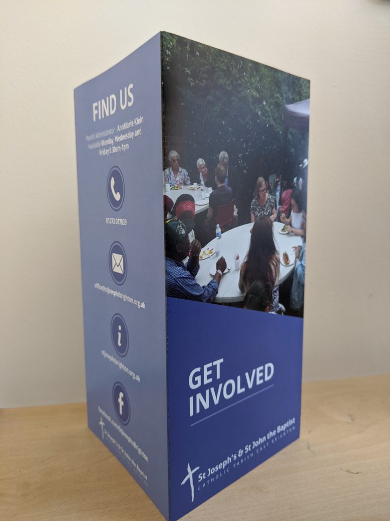
Wellspring Community, a charity organisation needed a brochure designed to showcase their latest events for young adults in their local community.
The Process
I first laid out a wire frame to work out how to lay out all their most important information. We arranged the information into a hierarchy of importance and tried to group it together under categories. I used their branding color blue is the main inspiration for the design, contact information and headings. I tried to make the design very simple and clear for people to find the information they were looking for. I also did some of the photography for the pictures used on the design
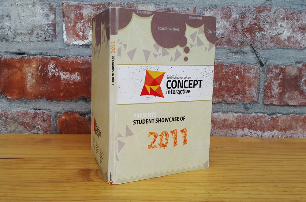
A college project that involved designing a DVD cover, flash interface and a poster that would be used to showcase the work of all the students in my college, Concept Interactive, for the year 2011.
The Process
I began with brainstorming ideas on Photoshop by creating a creative mess of shapes, circles, triangles and rectangles. I designed the year 2011 out of little orange triangles and used them again to make wavy patterns to communicate movement. The objective of this project was to create a look and feel that felt and looked creative to relate to the purpose of the DVD.
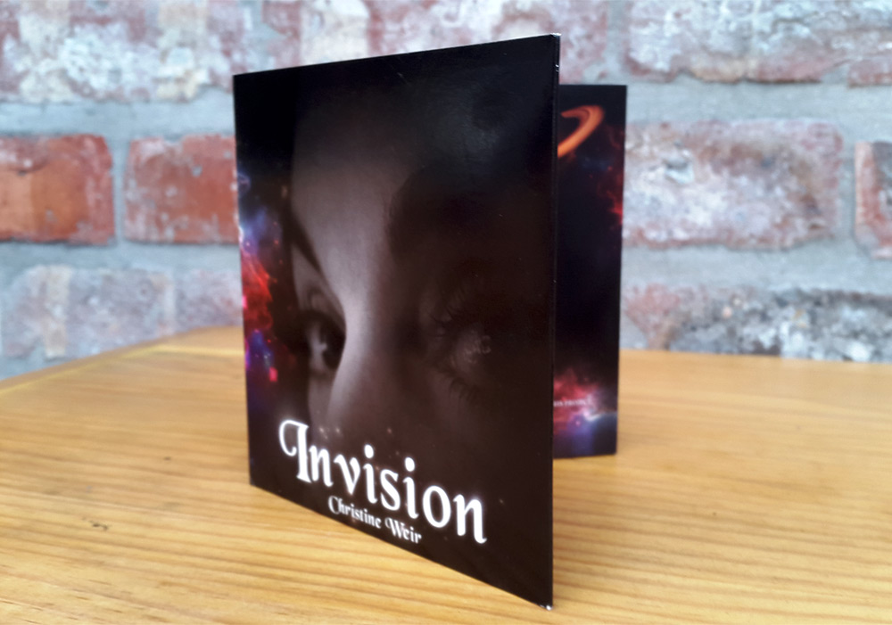
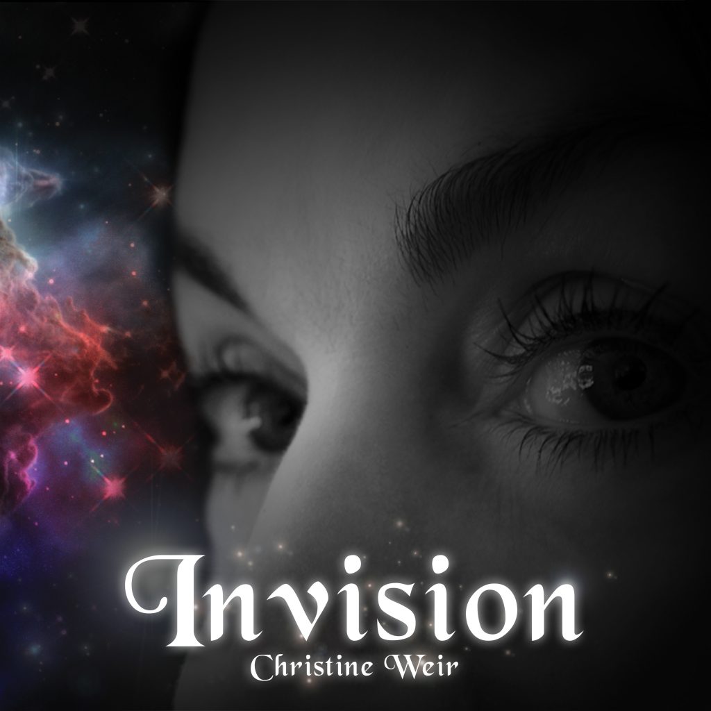
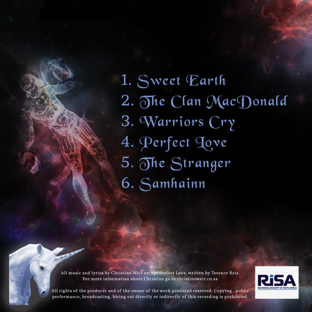
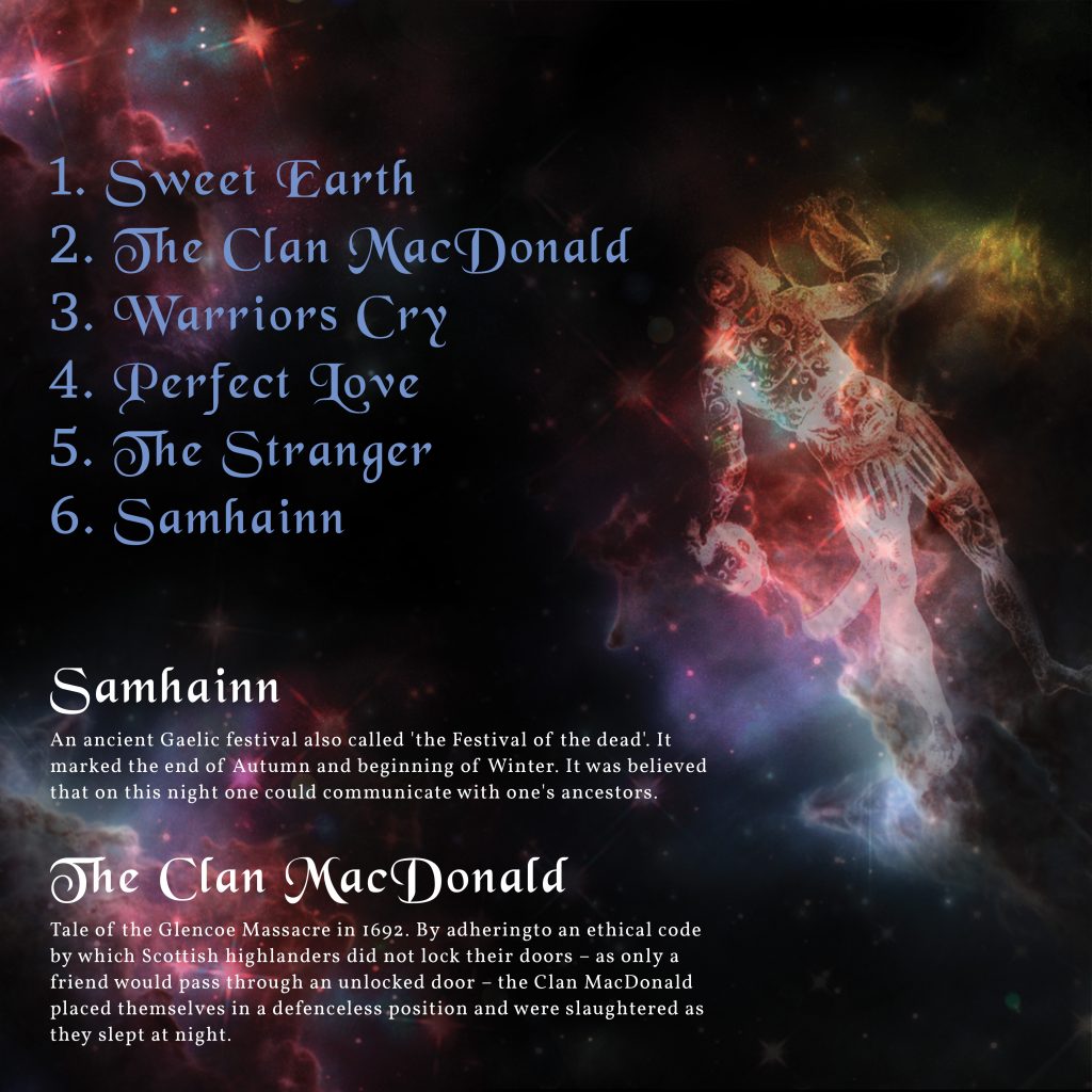
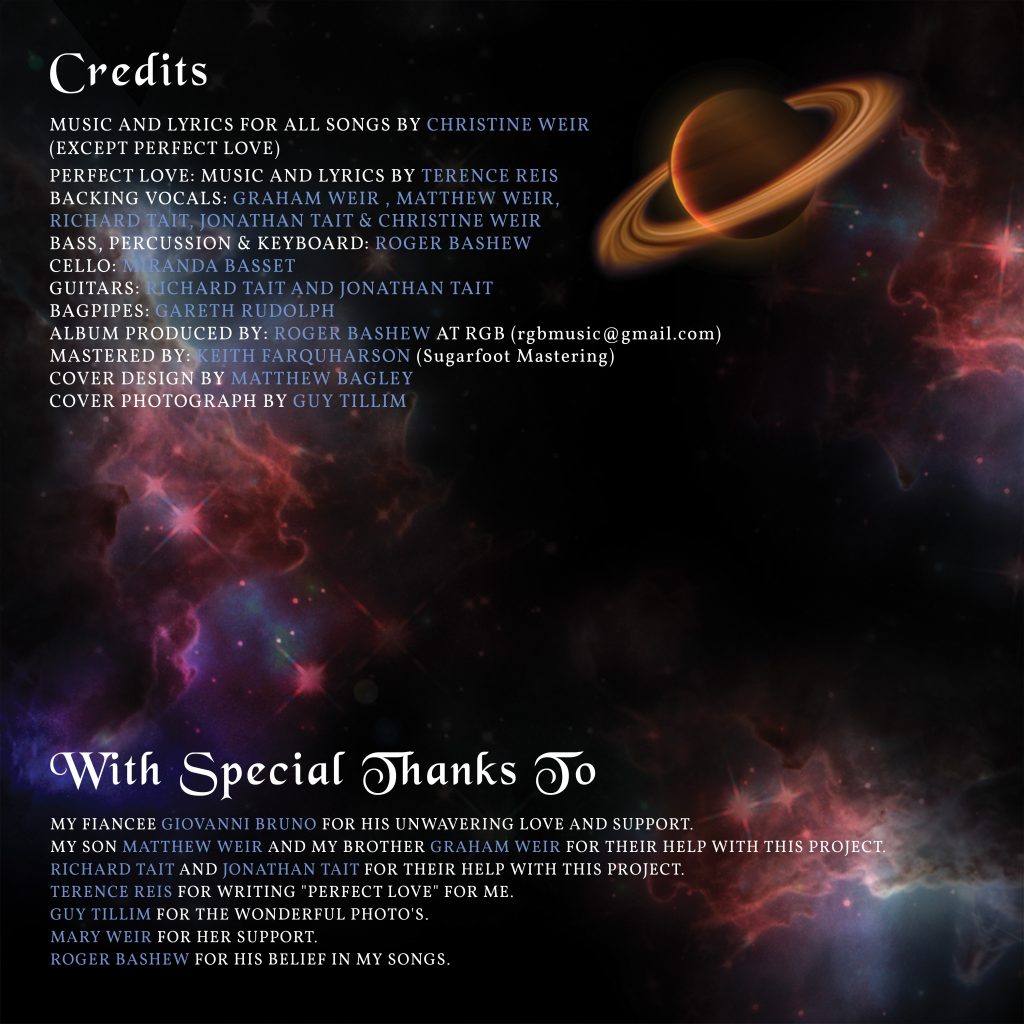
Vocalist Christine Weir needed an album cover design for her new album Invsion. She wanted the design to reflect the theme of her songs which all had a Scottish ancestral background. She wanted elements of space and magic to be incorporated into the design to give it a mythical look and feel.
Process
Working with the brief I collected a collage of images of planets, stars, the milky way, a unicorn and an image of a Pict popular in Scottish culture to recreate the look and feel of magic, space and mystery. I layered, cropped and blended these images together. I also played around with the coloring of blues, reds and purples to add more to the feeling of magic. The use of this font for the typography and the particles I created with the brush tool was to add to the Celtic and mythical look and feel.
Technology
Adobe Photoshop, Adobe InDesign
Front Cover
Back Cover
Front Inside Cover
Back Inside Cover
Posted in PrintComments Off on CHRISTINE WEIR ALBUM COVER